Case Reports: 2019 Vol: 25 Issue: 1
Branding Strategy Without Brand Name and Logo Case Study of Tobacco Industry Campaign
Elfa Swaratama, Institut Teknologi Telkom Purwokerto
Case Description
The author presents a study case of Tobacco Industry branding strategy after Government Regulation of Republic Indonesia number 109 of 2012 Article 36, which prohibit tobacco company to show their brand name and logo in their sponsored activities advertisements. The purpose of this study is to find out the possibilities of some brand identities absence while still maintain its brand equity to audiences. This study use Go Ahead Challenge poster from 2014 until 2017 that sponsored by Sampoerna A Mild cigarettes brand but doesn’t show those tobacco company brand name and logo. The visual identification system of Go Ahead Challenge poster itself shows similarities with Sampoerna A Mild brand identities, like symbols, color, typography and logo-mark and it reflected their audiences
Case Synopsis
Based on the survey from Tirto.id, state revenues from tobacco excise continue to increase each year. From 2015 until 2016, it was noted that the increase in state income had increased above 10 trillion. Even though the tobacco cigarette industry has provided quite a lot of excise tax on state revenues, the government seems to continue to limit cigarette industry promotion activities along with the increasing awareness of a healthy lifestyle (Figure 1).
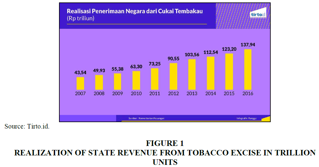
Figure 1: Realization Of State Revenue From Tobacco Excise In Trillion Units
The realization of the government's commitment to control the cigarette industry in its promotional activities reflected on Government Regulation of the Republic of Indonesia Number 109 of 2012 article 36, which reads:
1. Anyone who produces and/or imports Tobacco Products which sponsors an institution and/or individual activity can only be carried out with the following conditions: Do not use the Tobacco Product trademark and logo names including the brand image of Tobacco Products; and does not aim to promote Tobacco Products.
2. Sponsors, as referred to in paragraph (1), are prohibited for the activities of institutions and/or individuals covered by the media.
Based on the regulations above, cigarette companies cannot display logos and brand names on the sponsored activities, including publications such as posters, video, billboards and so on. Meanwhile, brand names and logos are very important to brand visualizations, considering these two things are a bridge between consumer perceptions and company values. Therefore, to reach successful brand equity, Tobacco Company must look for a brand strategy that still presents its brand value without showing their brand name and logo.
Aim And Method
This study aims to analyze the visual strategy of “Go Ahead Challenge” posters which doesn’t contain any logo and brand name of “Sampoerna A Mild” Tobacco Company, yet still reflect its company branding. The posters that are used for this research derived from their website (goaheadpeople.id) that contains information about their activity from 2014 until 2017 (Figure 2).
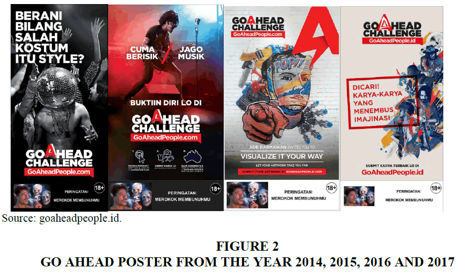
Figure 2: Go Ahead Poster From The Year 2014, 2015, 2016 And 2017
Go Ahead Challenge poster visual identification system contains elements like typography, logotype, symbol and color. Topalian (1984) remarks that those visual identification systems should reflect closely to their corporate identity to maintain their brand equity. This research will look those visual elements as a Go Ahead campaign method to reach “Sampoerna A Mild” brand equity and makes their audiences aware of company’s involvement on Go Ahead campaign without displaying their logo and brand name.
Logo And Branding
Brand is a method to connect companies and consumers emotionally which affect their success (Hembree, 2011), while visual communication like logo is a combining word, writing and aesthetic images, so that it connects with the audience and presents related information (Wheeler, 2009). Budellman (2010) argues that a logo is an image that represents a collective thought of an experience that shapes a person's perception of the organization he meets. While the brand identity is deeper than the logo, which involves the colors used on the company envelope, ring tones used by each customer they call and so on and makes consumers perceive the brand image.
Audiences must be convinced with branding elements that can be recognized and familiar. This can be achieved through the commitment of central ideas and have the capacity to go beyond times (Wheeler, 2009). For some companies, logo is arguably something that is mandatory. Even some companies consider that the logo is the most important thing on brand. In fact, the logo itself does not mean anything if the brand image is not strong. Good brands are formed from internal and external factors of the company's image. A good logo will be the embodiment of the brand image (Hollamby, 2018).
Branding in tobacco companies in Indonesia plays an important role in introducing and increasing brand awareness of their products. Because the Indonesian government indeed prohibits cigarette advertisements from displaying any tobacco products, smoking activities and smoking invitation messages. Because of it, cigarette advertisements in Indonesia use social phenomena to reach their audiences and then include logo and brand name at the end of their advertisements that act as brand awareness.
“GO AHEAD” AND “SAMPOERNA A MILD” BRAND SIMILARITIES
“Sampoerna A Mild” is a brand of mild grade machine clove cigarettes manufactured by PT HM Sampoerna (Figure 3). Compared to other mild cigarettes in Indonesia, “Sampoerna A Mild” is the most consumed and dominates market share which is 50.4%. Most consumers are male, who have occupations as a student (Prasetyo, 2016).
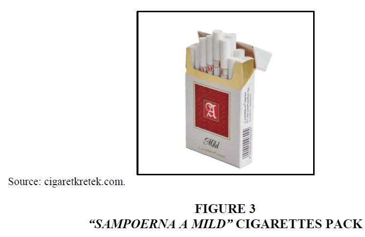
Figure 3: “Sampoerna A Mild” Cigarettes Pack
In 2009, “Sampoerna A Mild” launched a campaign called Go Ahead, which is a forum for the adult smoker community. 5 years later, “Go Ahead” launches an annual sub-campaign based on the goaheadpeople.id website. The sub-campaign is an art competition that offers opportunities to the winners to exhibit their work on public, which named “Go Ahead” Challenge (Figure 4).
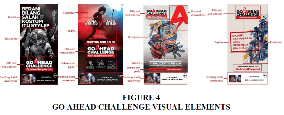
Figure 4: Go Ahead Challenge Visual Elements
Based on their website, Go Ahead competition has four main posters that contain information about their competition. Each poster has different form of illustration yet same messages. The illustration itself reflect “Sampoerna A Mild” audiences that’s young adult, which commonly can be seen on other “Sampoerna A Mild” advertisements that talk about youth culture and social issues.
On 2014 poster, the illustration shows topless guy surrounded by other people that look like partying, who wearing disco ball on his head with a tagline “Dare to say that wrong dress code is a style?” Meanwhile, on the 2015 poster, the image show male guitarist that looks passionate with a tagline “Just noisy/Music expert, prove yourself in”. On 2016, it shows graffiti-like illustration with wall background that said: “Ade Darmawan invites you to visualize it your way, let your artwork take you far”. On 2017 poster, it shows an illustration of 4 guys that represent each creative sector (music, photography, visual art and fashion/style) with the tagline “Wanted!! Artworks that can beyond imagination”. Those illustrations matched with “Sampoerna A Mild” customer that’s a male young adult proved with only using a male person as a model on those posters.
Color is often the fastest way for consumers to analyze brand identity (Gains, 2014) and one way to express visual identity (Jenkins, 1991). Even though the form and shape of “A” letter are changes between “Sampoerna A Mild logo” and almost every poster, but the similarities between letter “A” in “Go Ahead Challenge” and A in Sampoerna cigarette pack still founded. Those lettermarks still using a combination of red and white. Compared with other text in “Go Ahead Challenge” (Figure 5), letter A is the only font that has a different style which always using red color. In addition, the importance of letter A definitely can be seen on the 2016 poster. Those A lettermark displayed again in the right corner and enlarged.
Figure 5: Sampoerna A Mild Logo In And Letter A In The Go Ahead Challenge Text
The use of red color as a marker of the brand “Sampoerna A Mild” is also used in various advertising media. Consistency to use red letters A is done to achieve brand continuity. Strong brand identity is formed from the consistency of the brand on the formation of consumer perceptions. Involvement of all relevant promotional mixes with the aim of uniting, simplifying and strengthening brands (Gains, 2014) (Figure 6).
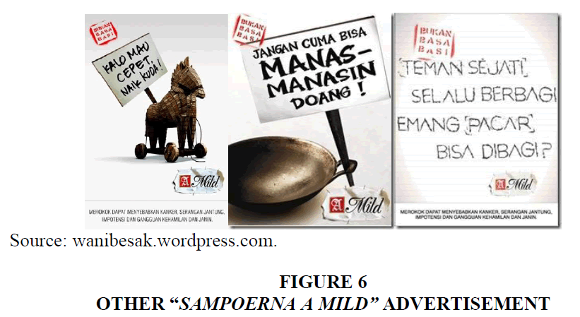
Figure 6: Other “Sampoerna A Mild” Advertisement
Conclusion
Based on the research above, the author found many visual similarities through visual identification system between “Go Ahead Challenge” poster and “Sampoerna A Mild” brand identity. Go Ahead Challenge poster that illustrates youth culture and showing photographed men as a symbol. Letter A on “Go Ahead Challenge” text itself resemble “Sampoerna A Mild” logogram. Finally, red color as a mark of Sampoerna A Mild also used in those posters.
The idea of logo and brand name absence in branding itself need further research. This case study shows that “Sampoerna A Mild” effort to represent their company through Go Ahead Challenge poster can be accomplished with using “Sampoerna A Mild” brand identities like color, illustration style and symbol. The consistency of visual identities can affect how successful those brand to reach their audiences, even without using their brand name and logo on advertisements media
References
- Budelmann, K., Wozniak, C., & Kim, Y. (2010). Brand identity essentials, (Firstst Edition). New York.
- Gains, N. (2014). Brand essense: Using sense, symbol, and story to design brand identity (First Edition). Great Britain.
- Hembree, R. (2011). The complete graphic designer: A guide to understanding graphics and visual Communication, (First Edition). Massachusetts: Rockport Publishers.
- Hollamby, J. (2018). Forget about your f**king logo. Nobody cares. Retrieved from https://medium.com/design-domain/forget-about-your-fucking-logo-nobody-cares-c5e92c12730
- Jenkins, N. (1991). The business of image. Kogan Page: Kogan Page.
- Prasetyo, M.H. (2016). Aktivitas integrated marketing communications terhadap brand image untuk industri rokok kelas mild. Jurnal Manajemen Teori Dan Terapan , 5(1), 23-33.
- Topalian, A. (1984). Corporate identity: Beyond the visual overstatements. International Journal of Advertising, 3(1), 55-62.
- Wheeler, A. (2009). Designing brand identity, canada, (Third Edition). New Jersey: John Wiley & Sons, Inc.